Slider
Select a single value or a range by dragging one or two handles.
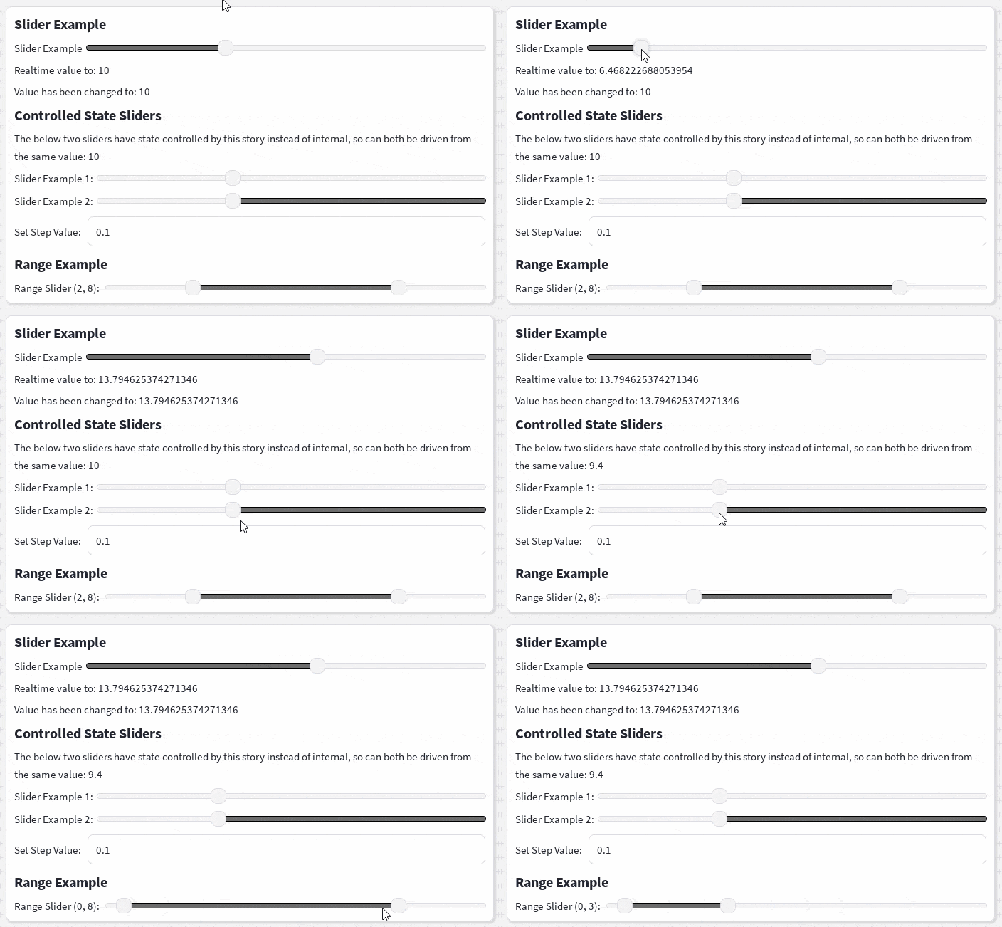
The <Slider> component lets users select a numeric value within a defined range. It supports step snapping, controlled and uncontrolled state, range selection, and highlighted sections of the track.
Basic usage
onDragged is called continuously while the handle is moving. onChanged is called once when the drag finishes.
Step values
Use step to snap the slider to fixed increments. Steps are calculated relative to min-value.
<Slider
    min-value={5}
    max-value={20}
    step={2}
/>
The example above produces values such as 5, 7, 9, and 11.
Controlled slider
Set controlled when the rendered value should always come from the value prop.
const [value, setValue] = React.useState(10);

<Slider
    controlled
    min-value={0}
    max-value={100}
    step={5}
    value={value}
    onDragged={(newValue) => {
        if (typeIs(newValue, "number")) {
            setValue(newValue);
        }
    }}
/>
Without controlled, value is used as the initial value and the slider manages subsequent changes internally.
Range slider
Enable range and provide a Vector2 value to display two handles. X is the lower value and Y is the upper value.
const [range, setRange] = React.useState(
    new Vector2(2, 8),
);

<Slider
    controlled
    range
    min-value={0}
    max-value={10}
    step={1}
    value={range}
    highlight="middle"
    onDragged={(newValue) => {
        if (typeIs(newValue, "Vector2")) {
            setRange(newValue);
        }
    }}
/>
The handles cannot cross each other. Moving the first handle is clamped to the second handle, and moving the second handle is clamped to the first.
Track highlighting
The highlight prop controls which part of the slider track is highlighted.
<Slider
    min-value={0}
    max-value={10}
    value={4}
    highlight="start"
/>| Value | Highlighted section |
|---|---|
"start" | From the beginning of the track to the handle |
"end" | From the handle to the end of the track |
"middle" | Between the two range handles |
"middle" is primarily intended for range sliders.
Native properties
Slider is built on Container's sizing and positioning props (SizeElementProps, PositionElementProps), but its root is a native Roblox Frame rather than Container's ImageLabel, so it accepts native Frame properties directly, including Position, AnchorPoint, BackgroundColor3, ZIndex, Change, and Event.
<Slider
    min-value={0}
    max-value={100}
    value={50}
    BackgroundColor3={Color3.fromHex("#1F2937")}
    ZIndex={2}
/>Size, Position, and AnchorPoint are resolved the same way as Container, so the width, height, top, left, right, bottom, and center props also apply. The slider's height defaults to theme.components.slider.height unless Size or height is provided.
BackgroundTransparency defaults to 1 but can be overridden.
Props
Slider-specific props
| Prop | Type | Default | Description |
|---|---|---|---|
max-value | number | Required | Maximum slider value. |
min-value | number | 0 | Minimum slider value. |
value | number | Vector2 | Minimum value | Current or initial slider value. Defaults to min-value (or Vector2(min-value, max-value) when range is set). |
step | number | — | Increment used when snapping values. |
controlled | boolean | false | Reads the rendered value directly from value. |
range | boolean | false | Enables two-handle range selection using a Vector2. |
highlight | "start" | "end" | "middle" | — | Selects the highlighted section of the track. |
onDragged | (value: number | Vector2) => void | — | Called while a handle is dragged. |
onChanged | (value: number | Vector2) => void | — | Called when dragging finishes. |
Shared props
The slider also supports the sizing and positioning props used by Container.
| Interface | Purpose |
|---|---|
SizeElementProps | Configures width, height, and Size. |
PositionElementProps | Configures Position, AnchorPoint, center, and edge offsets. |
ZIndexElementProps | Configures the slider's ZIndex. |
React.InstanceProps<Frame> | Accepts native Frame properties, including Change and Event. |
Theme values
The slider uses values from theme.components.slider for:
- Overall height (used when
Size/heightis not provided) - The track bar's height, internal padding, border, corner radius, background, and highlight colours
- The handle's border, corner radius, background, box shadow (shown while hovered or dragged), and aspect ratio
These values can be changed by providing a custom Clean UI theme.