Fieldset
Group a label and form control into a responsive layout
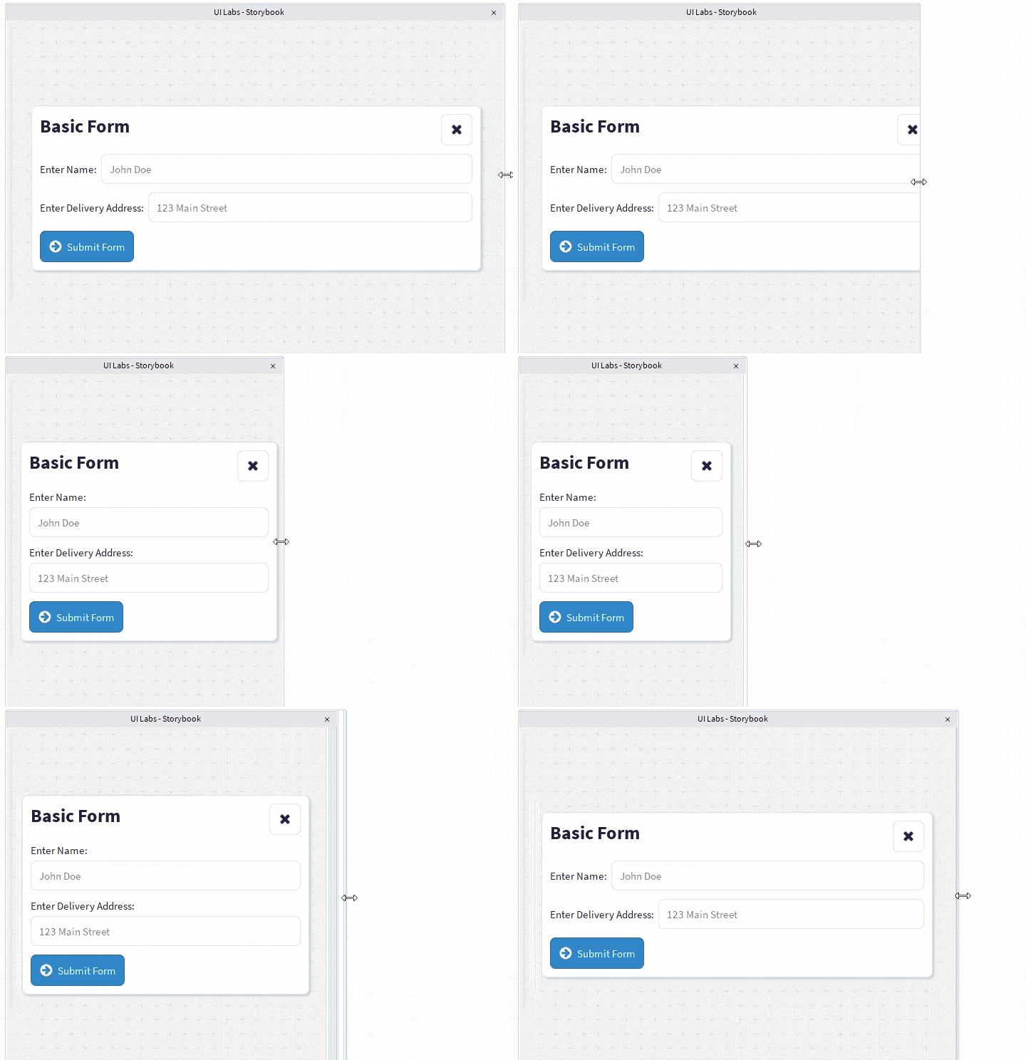
<Fieldset> arranges a label and form control into a consistent horizontal layout.
It uses a compound component API with two slots:
Fieldset.Labelcontains the field label.Fieldset.Controlcontains the input or control.
Basic usage
Layout
By default, the label and control are displayed next to each other.
The label is sized to its content, while the control grows to fill the remaining available space.
<Fieldset>
    <Fieldset.Label>
        <Text text="Email Address:" />
    </Fieldset.Label>

    <Fieldset.Control>
        <Input
            placeholder="john@example.com"
            value=""
        />
    </Fieldset.Control>
</Fieldset>
This is equivalent to manually creating a horizontal stack with fixed and flexible items:
<Container>
    <HStack
        Wraps={false}
        valign="Center"
        HorizontalFlex={Enum.UIFlexAlignment.Fill}
    >
        <FlexItem
            mode="Custom"
            ShrinkRatio={0}
            GrowRatio={0}
        >
            <Text text="Email Address:" />
        </FlexItem>

        <FlexItem
            mode="Custom"
            ShrinkRatio={1}
            GrowRatio={1}
        >
            <Input
                placeholder="john@example.com"
                value=""
            />
        </FlexItem>
    </HStack>
</Container>
Responsive wrapping
A fieldset can wrap its label and control onto separate rows at smaller breakpoints.
By default, wrapping is enabled at the lg breakpoint and below.
<Fieldset wrap="md">
    <Fieldset.Label>
        <Text text="Character Name:" />
    </Fieldset.Label>

    <Fieldset.Control>
        <Input
            placeholder="Enter a name"
            value=""
        />
    </Fieldset.Control>
</Fieldset>
In this example:
- At
md,sm, andxs, the fieldset can wrap. - At
lgandxl, the label and control remain on the same row.
The active breakpoint is determined from the width of the Fieldset container.
Custom breakpoints
Use the breakpoints prop to override the theme breakpoint values for an individual fieldset.
<Fieldset
    wrap="md"
    breakpoints={{
        xs: 0,
        sm: 300,
        md: 500,
        lg: 700,
        xl: 900,
    }}
>
    <Fieldset.Label>
        <Text text="Display Name:" />
    </Fieldset.Label>

    <Fieldset.Control>
        <Input
            placeholder="John Doe"
            value=""
        />
    </Fieldset.Control>
</Fieldset>
When breakpoints is not provided, the values from the current theme are used.
Disabled state
Use the disabled prop to provide a disabled state to the fieldset and its child slots.
<Fieldset disabled>
    <Fieldset.Label>
        <Text text="Username:" />
    </Fieldset.Label>

    <Fieldset.Control>
        <Input
            placeholder="Username"
            value=""
        />
    </Fieldset.Control>
</Fieldset>
The disabled value is provided through the fieldset context, allowing controls inside the fieldset to respond to the shared state.
Fieldset.Label
Fieldset.Label contains the label associated with the control.
<Fieldset.Label>
    <Text text="Password:" />
</Fieldset.Label>
The label does not grow or shrink, so it remains sized to its content.
Fieldset.Label must be used inside a Fieldset.
Fieldset.Control
Fieldset.Control contains the input or interactive control.
<Fieldset.Control>
    <Input
        placeholder="Password"
        value=""
    />
</Fieldset.Control>
The control is allowed to grow and shrink, causing it to fill the remaining width of the fieldset.
When the parent Fieldset has checkbox set, Fieldset.Control instead keeps its own content size (matching Fieldset.Label's behaviour), which is what Checkbox relies on to sit naturally next to its label. See Checkbox for an example.
Fieldset.Control must be used inside a Fieldset.
Complete example
<Container width="75%" center>
    <Fieldset wrap="sm">
        <Fieldset.Label>
            <Text
                text="Enter Name:"
                variant="body"
                TextWrap={false}
            />
        </Fieldset.Label>

        <Fieldset.Control>
            <Input
                placeholder="John Doe"
                value=""
            />
        </Fieldset.Control>
    </Fieldset>
</Container>
Props
Fieldset
| Prop | Type | Default | Description |
|---|---|---|---|
disabled | boolean | false | Provides a disabled state to the fieldset context. |
checkbox | boolean | false | Marks the fieldset as pairing a checkbox with its label, so Fieldset.Control sizes to its content instead of growing/shrinking. |
wrap | Breakpoint | "lg" | The highest breakpoint at which the label and control may wrap. |
breakpoints | BreakpointValue<number> | Theme value | Overrides the theme breakpoint widths. |
children | React.ReactNode | — | The fieldset label and control slots. |
Fieldset.Label
| Prop | Type | Description |
|---|---|---|
children | React.ReactNode | The label content. |
Fieldset.Control
| Prop | Type | Description |
|---|---|---|
children | React.ReactNode | The input or control content. |