Input
A themed text input with responsive sizing, spacing, validation, and change events
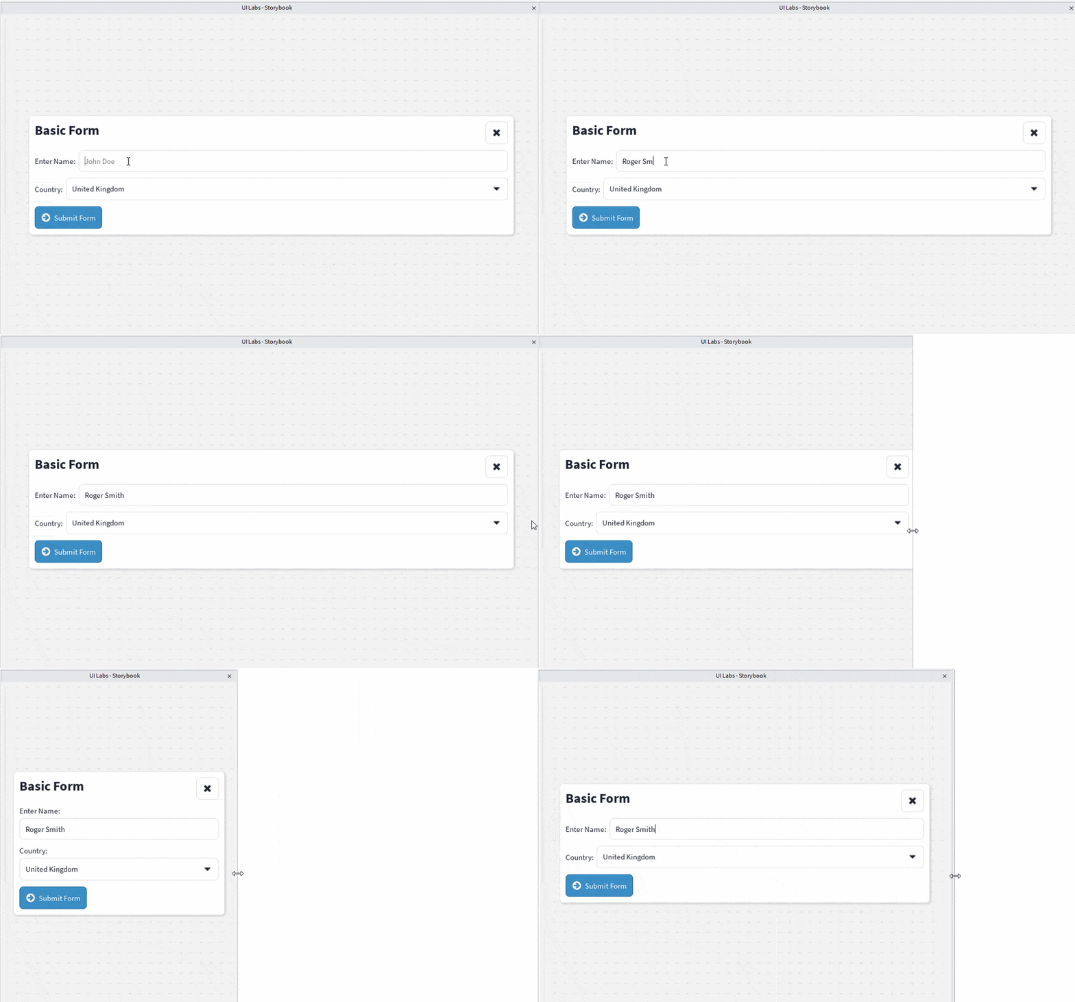
<Input> is a styled wrapper around Roblox's native TextBox.
It automatically applies the current Clean UI theme, including typography, border styling, corner radius, text color, and internal padding.
Basic Usage
The value prop sets the initial value of the input, while onChange is called whenever the text changes.
Placeholder
You can provide placeholder text using the simplified placeholder prop:
<Input
    value=""
    placeholder="Enter your name"
/>
You can also use the native Roblox PlaceholderText prop:
<Input
    value=""
    PlaceholderText="Enter your name"
    PlaceholderColor3={Color3.fromHex("#888888")}
/>
When both are provided, PlaceholderText takes priority over placeholder.
Icon
Set the icon prop to render a leading icon before the text field.
<Input
    value=""
    icon="search"
    placeholder="Search..."
/>
The icon is vertically centered alongside the text and does not wrap onto its own line. Its color is controlled by theme.components.input.iconColor, falling back to the same default text color as the input itself when the theme doesn't define one.
Validation
The validation prop can restrict which values may be entered.
Number
Use Number to allow integers and decimal numbers:
<Input
    value=""
    placeholder="Enter an amount"
    validation="Number"
    onChange={(value) => {
        print(`Amount changed to: ${value}`);
    }}
/>
The input also temporarily allows an empty string or a single minus sign, making it possible to enter negative numbers.
Integer
Use Int to only allow whole numbers:
<Input
    value=""
    placeholder="Enter your age"
    validation="Int"
/>
Decimal values are rejected.
Min and Max
When validation is "Number" or "Int", the min and max props constrain the accepted value:
<Input
    value=""
    placeholder="Enter a percentage"
    validation="Number"
    min={0}
    max={100}
/>
min and max are not enforced while typing. Instead, they are checked when the input loses focus: if the value falls outside the [min, max] range, it is clamped to the nearest bound and onChange is called with the clamped value.
Telephone
Use Telephone to restrict input to digits, +, -, spaces, and parentheses:
<Input
    value=""
    placeholder="Enter your phone number"
    validation="Telephone"
/>
This only restricts which characters can be typed; it does not enforce a specific phone number format.
Alphanumeric
Use Alphanumeric to allow only letters and digits:
<Input
    value=""
    placeholder="Enter a username"
    validation="Alphanumeric"
/>
Spaces, punctuation, and other symbols are rejected.
Use Email to allow only characters valid within an email address, letters, digits, @, ., _, -, and +:
<Input
    value=""
    placeholder="Enter your email address"
    validation="Email"
/>
This only restricts which characters can be typed; it does not verify that the resulting text is a well-formed email address.
String
Use String for a normal text input:
<Input
    value=""
    placeholder="Enter your display name"
    validation="String"
/>
String currently behaves the same as None and does not restrict the entered text.
None
Use None, or omit validation, to disable validation:
<Input
    value=""
    validation="None"
/>
Responding to Changes
Use onChange to receive the current text whenever the user edits the input:
function SearchInput() {
    const [query, setQuery] = React.useState("");

    return (
        <Input
            value={query}
            placeholder="Search..."
            onChange={(value) => {
                setQuery(value);
                print(`Searching for: ${value}`);
            }}
        />
    );
}
Roblox Events
The native TextBox events can be passed through the Event prop:
<Input
    value=""
    placeholder="Enter a message"
    Event={{
        Focused: () => {
            print("Input focused");
        },

        FocusLost: (enterPressed) => {
            if (enterPressed) {
                print("Enter was pressed");
            }
        },
    }}
/>
Scaling
Input supports the shared scale prop. The selected scale is used to resolve the input typography from the active theme.
<Input
    value=""
    placeholder="Small input"
    scale="sm"
/>

<Input
    value=""
    placeholder="Large input"
    scale="lg"
/>
Available scales are:
xssmmdlgxl
The exact font size and font weight are determined by the active theme.
Spacing
The shared spacing prop controls the internal padding around the text:
<Input
    value=""
    placeholder="Spacious input"
    spacing="lg"
/>
Controlled input
By default, Input manages its own text internally after mounting with value as the initial text; further changes to value from the parent are ignored. Set controlled to always display value directly, mirroring the usual controlled-input pattern.
function ControlledInput() {
    const [text, setText] = React.useState("Hello");

    return (
        <Input
            controlled
            value={text}
            onChange={setText}
        />
    );
}
Native TextBox Properties
Input extends React.InstanceProps<TextBox>, so native Roblox TextBox properties can be passed directly to it.
<Input
    value="Hello"
    TextXAlignment={Enum.TextXAlignment.Center}
    TextColor3={Color3.fromHex("#FFFFFF")}
    PlaceholderColor3={Color3.fromHex("#AAAAAA")}
    TextScaled={false}
/>
Some properties are managed internally by the component, including:
TextFontFaceFontSizeLineHeightBackgroundTransparency(set from the theme, see Theme Styling)ClearTextOnFocusAutomaticSize
A Change handler can also be supplied to react to native property-changed events. Input merges your Change handlers with its own internal Change.Text handling, so a Change.Text handler you provide still runs alongside the component's built-in validation.
<Input
    value=""
    validation="Int"
    Change={{
        Text: (rbx) => {
            print(`Native Text changed to: ${rbx.Text}`);
        },
    }}
/>
Props
| Prop | Type | Default | Description |
|---|---|---|---|
value | string | Required | The initial text displayed by the input. |
placeholder | string | undefined | Simplified alias for PlaceholderText. |
validation | "Number" | "String" | "None" | "Int" | "Telephone" | "Alphanumeric" | "Email" | undefined | Restricts the values accepted by the input. |
min | number | undefined | Minimum value allowed when validation is "Number" or "Int". Enforced on blur, not while typing. |
max | number | undefined | Maximum value allowed when validation is "Number" or "Int". Enforced on blur, not while typing. |
onChange | (value: string) => void | undefined | Called whenever the input value changes. |
icon | IconName | undefined | Renders a leading icon before the text field. |
controlled | boolean | false | Displays value directly instead of managing text internally. |
Event | React.InstanceEvent<TextBox> | undefined | Native Roblox event handlers for the underlying TextBox. |
scale | ScaleSize | Theme default | Controls the typography scale. |
spacing | SpaceSize | Theme default | Controls the internal padding. |
PlaceholderText | string | placeholder | Native Roblox placeholder text. Takes priority over placeholder. |
TextXAlignment | Enum.TextXAlignment | Left | Controls horizontal text alignment. |
TextColor3 | Color3 | Theme primary text color | Controls the input text color. |
PlaceholderColor3 | Color3 | Roblox default | Controls the placeholder text color. |
TextScaled | boolean | Roblox default | Enables Roblox text scaling. |
Change | React.InstanceChangeEvent<TextBox> | undefined | Native property-changed handlers, merged with the component's internal validation. |
All other compatible native TextBox properties are also accepted.
Theme Styling
The appearance of the input is controlled by theme.components.input.
The component uses the following theme values:
theme.components.input.typography
theme.components.input.borderThickness
theme.components.input.borderColor
theme.components.input.cornerRadius
theme.components.input.backgroundColor
theme.components.input.backgroundTransparency
theme.components.input.backgroundImage
theme.components.input.backgroundGradient
theme.components.input.placeholder
theme.components.input.iconColor
backgroundColor and backgroundTransparency are optional and give the input a flat fill. backgroundTransparency defaults to 1, so the fill is invisible unless a theme sets it lower. No shipped theme sets either value. A backgroundImage draws on top of the fill, so a theme extending one that has a background image (such as WoodenTheme) can clear it with backgroundImage: { image: "" } to show only the flat colour.
A cornerRadius of 0 gives square corners.
const MyTheme = extendTheme(WoodenTheme, {
    components: {
        input: {
            backgroundColor: Color3.fromHex("#295896"),
            backgroundTransparency: 0,
            backgroundImage: { image: "" },
            borderColor: Color3.fromHex("#3D2712"),
            borderThickness: 3,
            cornerRadius: 0,
            typography: { color: Color3.fromHex("#FFF7CF") },
            placeholder: { color: Color3.fromHex("#8FA6C4") },
            iconColor: Color3.fromHex("#FFF7CF"),
        },
    },
});
Because a searchable Select renders an Input for its search row, it picks up the same styling.
iconColor is optional and only affects the leading icon rendered when the icon prop is set. If the theme doesn't define it, the icon falls back to the same default text color as the input.
The default text color is resolved from theme.components.input.typography's color. If that doesn't specify a color, it falls back to:
theme.colors.intents.primary.default.textColorThese values can be changed by providing a custom Clean UI theme.
Complete Example
import React, { useState } from "@rbxts/react";
import { Input, VStack } from "@rbxts/react-clean-ui";

export function RegistrationForm() {
    const [username, setUsername] = useState("");
    const [age, setAge] = useState("");

    return (
        <VStack spacing="md">
            <Input
                value={username}
                placeholder="Username"
                onChange={setUsername}
            />

            <Input
                value={age}
                placeholder="Age"
                validation="Int"
                onChange={setAge}
            />
        </VStack>
    );
}