Checkbox
A clickable checkbox control with configurable icons, intents, spacing, and scale.
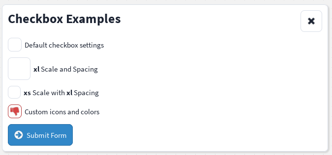
The Checkbox component allows users to toggle a boolean value.
It manages its own checked state internally and can optionally be given an initial state using the checked prop.
When used inside a Fieldset, clicking the fieldset label also toggles the checkbox.
Import
import { Checkbox } from "@rbxts/react-clean-ui";Basic usage
The checkbox starts unchecked by default.
Initial checked state
Use the checked prop to specify the initial state of the checkbox.
<Checkbox checked />or
<Checkbox checked={true} />You can also explicitly start unchecked.
<Checkbox checked={false} />The checked prop is only used to determine the initial state when the component is created. After that, the checkbox manages its own state internally.
With a fieldset
Use Fieldset.Control and Fieldset.Label to associate the checkbox with a label.
<Fieldset checkbox>
    <Fieldset.Control>
        <Checkbox
            onChange={(checked) => {
                print(`Checked: ${checked}`);
            }}
        />
    </Fieldset.Control>

    <Fieldset.Label>
        <Text text="Receive email notifications" />
    </Fieldset.Label>
</Fieldset>
When the user clicks either the checkbox or its label, the checked state will toggle.
Scale and spacing
The scale prop controls the size of the checkbox icon.
The spacing prop controls the internal padding around the icon.
<Fieldset checkbox>
    <Fieldset.Control>
        <Checkbox
            scale="xl"
            spacing="xl"
        />
    </Fieldset.Control>

    <Fieldset.Label>
        <Text text="<b>xl</b> Scale and Spacing" />
    </Fieldset.Label>
</Fieldset>
Scale and spacing can be configured independently.
<Fieldset checkbox>
    <Fieldset.Control>
        <Checkbox
            scale="xs"
            spacing="xl"
        />
    </Fieldset.Control>

    <Fieldset.Label>
        <Text text="<b>xs</b> Scale with <b>xl</b> Spacing" />
    </Fieldset.Label>
</Fieldset>
Custom icons
Use icon-checked and icon-unchecked to customise the icon displayed for each state.
<Checkbox
    icon-checked="thumbs-up"
    icon-unchecked="thumbs-down"
/>
If icon-unchecked is omitted, no icon is displayed while the checkbox is unchecked.
Checked and unchecked intents
The appearance of each state can be configured independently.
<Checkbox
    icon-checked="thumbs-up"
    icon-unchecked="thumbs-down"
    intent-checked="info"
    intent-unchecked="danger"
/>
The selected intent controls the border and icon colours for each state.
Complete example
<Fieldset checkbox>
    <Fieldset.Control>
        <Checkbox
            checked
            icon-checked="thumbs-up"
            icon-unchecked="thumbs-down"
            intent-checked="info"
            intent-unchecked="danger"
            onChange={(checked) => {
                print(`Checked: ${checked}`);
            }}
        />
    </Fieldset.Control>

    <Fieldset.Label>
        <Text text="Enable advanced mode" />
    </Fieldset.Label>
</Fieldset>
Props
Checkbox-specific props
| Prop | Type | Default | Description |
|---|---|---|---|
checked | boolean | false | The initial checked state of the checkbox. |
onChange | (value: boolean) => void | undefined | Called whenever the checked state changes. |
icon-checked | IconName | "check" | Icon displayed while checked. |
icon-unchecked | IconName | undefined | Icon displayed while unchecked. |
intent-checked | Intent | "success" | Intent used for the checked border and icon colours. |
intent-unchecked | Intent | "primary" | Intent used for the unchecked border and icon colours. |
Shared props
The checkbox also supports props inherited from the following interfaces.
| Interface | Purpose |
|---|---|
IntentElementProps | Configures the checkbox's base background intent, independent of intent-checked/intent-unchecked. |
PaddingProps | Configures individual padding values. |
BackgroundElementProps | Configures background colour and transparency. |
SpacedElementProps | Configures theme-based internal spacing. |
ScalableElementProps | Configures the icon scale. |
Behaviour
- The checkbox is unchecked by default.
- Setting
checkedchanges the initial state only. - Clicking the checkbox toggles the internal state.
- When inside a
Fieldset, clicking the associated label also toggles the checkbox. onChangeis called whenever the checked state changes.
The state transitions follow this pattern:
false → true → falseTheme values
The checkbox uses values from theme.components.checkbox for:
- Corner radius
- Border thickness and transparency
- Border and icon colours, based on the checked/unchecked intent
- Default spacing/padding
- Background image
The solid background colour (based on the intent prop's default state) and background transparency fall back to the values from theme.components.button.