Select
Allow users to choose one option from a dropdown list.
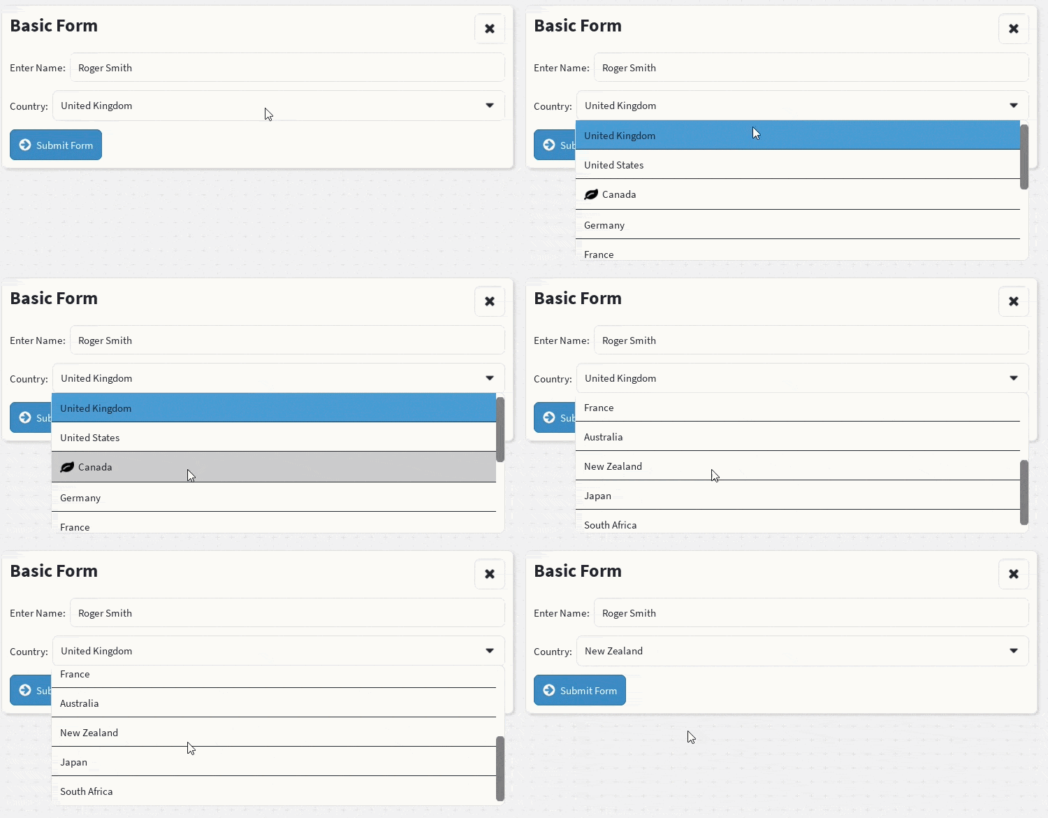
The <Select> component displays a dropdown menu containing a list of selectable options.
Use <Select.Option> components as direct children of <Select> to define the available choices. Related options can be grouped under a heading with <Select.OptGroup>, and the dropdown can expose a search box to filter options with the searchable property.
Import
import {
    Fieldset,
    Select,
    Text,
} from "@rbxts/react-clean-ui";
Basic Usage
Example
The Select component can be combined with a Fieldset to provide a label and consistent form layout.
<Fieldset>
    <Fieldset.Label>
        <Text text="Country:" />
    </Fieldset.Label>

    <Fieldset.Control>
        <Select>
            <Select.Option text="United Kingdom" />
            <Select.Option text="United States" />
            <Select.Option text="Canada" />
            <Select.Option text="Germany" />
            <Select.Option text="France" />
            <Select.Option text="Australia" />
            <Select.Option text="New Zealand" />
            <Select.Option text="Japan" />
            <Select.Option text="South Africa" />
        </Select>
    </Fieldset.Control>
</Fieldset>
Handling Selection Changes
Use the onChange callback to receive the index of the selected option. If the selected Select.Option has a value prop, it's passed as the second argument.
function CountrySelect() {
    const [selectedCountry, setSelectedCountry] =
        React.useState(0);

    return (
        <Fieldset>
            <Fieldset.Label>
                <Text text="Country:" />
            </Fieldset.Label>

            <Fieldset.Control>
                <Select
                    selected={selectedCountry}
                    onChange={(index) => {
                        setSelectedCountry(index);
                        print(`Selected option: ${index}`);
                    }}
                >
                    <Select.Option text="United Kingdom" />
                    <Select.Option text="United States" />
                    <Select.Option text="Canada" />
                </Select>
            </Fieldset.Control>
        </Fieldset>
    );
}
The callback receives the zero-based index of the selected option:
<Select
    onChange={(index) => {
        print(index);
    }}
>
    <Select.Option text="First" />
    <Select.Option text="Second" />
    <Select.Option text="Third" />
</Select>
Selecting First returns 0, selecting Second returns 1, and selecting Third returns 2.
Default Selection
Use the selected property to specify which option is initially selected.
<Select selected={1}>
    <Select.Option text="Small" />
    <Select.Option text="Medium" />
    <Select.Option text="Large" />
</Select>
In this example, Medium is initially selected because it has an index of 1.
When selected is not provided, the first option is selected.
Custom Option Content
An option can contain custom children instead of only displaying text.
<Select>
    <Select.Option text="Information" />

    <Select.Option>
        <Text
            text="Custom Option"
            weight="bold"
        />
    </Select.Option>
</Select>
You can also combine the text property with additional children.
<Select>
    <Select.Option text="Standard" />

    <Select.Option text="Premium">
        <Text text="Recommended" />
    </Select.Option>
</Select>
The value shown in the closed select control is taken from the selected option's text property.
For this reason, options should normally provide text, even when they also contain custom children.
Grouping Options
Wrap a run of Select.Option components in Select.OptGroup to render a section header above them in the dropdown.
<Select>
    <Select.OptGroup label="Europe">
        <Select.Option text="United Kingdom" />
        <Select.Option text="Germany" />
        <Select.Option text="France" />
    </Select.OptGroup>

    <Select.OptGroup label="North America">
        <Select.Option text="United States" />
        <Select.Option text="Canada" />
    </Select.OptGroup>
</Select>
Select.OptGroup must be a direct child of Select. Selection is still index-based via selected/onChange, and indexes are assigned across all options in document order regardless of grouping. In the example above, the "Europe" options are indexes 0-2 and the "North America" options are indexes 3-4.
A Select.OptGroup with no Select.Option children doesn't render a header.
Select.Option and Select.OptGroup can also be mixed with ungrouped options:
<Select>
    <Select.Option text="United Kingdom" />

    <Select.OptGroup label="North America">
        <Select.Option text="United States" />
        <Select.Option text="Canada" />
    </Select.OptGroup>
</Select>
Searchable Options
Set searchable to render a filter textbox above the option list. The search box is a standard Input field, complete with its own border and corner radius, with a search icon prepended, inset with margin at the top of the dropdown. Typing filters options by a case-insensitive substring match against each option's text property.
<Select searchable>
    <Select.Option text="United Kingdom" />
    <Select.Option text="United States" />
    <Select.Option text="Canada" />
</Select>
Options that only use children, without a text property, can't be matched against the search text and are always shown.
Use searchPlaceholder to customize the search box's placeholder text, which defaults to "Search".
<Select searchable searchPlaceholder="Search countries...">
    <Select.Option text="United Kingdom" />
    <Select.Option text="United States" />
    <Select.Option text="Canada" />
</Select>
When searchable is combined with Select.OptGroup, a group's header is hidden if every option inside that group is filtered out. If no option anywhere matches the search text, the dropdown shows a "No Results" row instead of the option list.
<Select searchable>
    <Select.OptGroup label="Europe">
        <Select.Option text="United Kingdom" />
        <Select.Option text="Germany" />
        <Select.Option text="France" />
    </Select.OptGroup>

    <Select.OptGroup label="North America">
        <Select.Option text="United States" />
        <Select.Option text="Canada" />
    </Select.OptGroup>
</Select>
Option Events
Select.Option accepts Roblox instance events through the Event property.
<Select>
    <Select.Option
        text="United Kingdom"
        Event={{
            MouseEnter: () => {
                print("Hovering United Kingdom");
            },
        }}
    />

    <Select.Option
        text="United States"
        Event={{
            Activated: () => {
                print("United States selected");
            },
        }}
    />
</Select>
The component preserves its internal hover and selection behaviour while calling the supplied event handlers.
Option Background Colour
Use BackgroundColor3 to provide a custom base colour for an option.
<Select>
    <Select.Option
        text="Standard"
        BackgroundColor3={Color3.fromHex("#FFFFFF")}
    />

    <Select.Option
        text="Highlighted"
        BackgroundColor3={Color3.fromHex("#E8F1FF")}
    />
</Select>
Hover and selected-state colours may still be adjusted by the active theme.
Dropdown Height and Scrolling
The dropdown automatically grows to fit its options until it reaches its configured maximum height.
By default, the maximum height is taken from the active theme:
<Select>
    <Select.Option text="Option 1" />
    <Select.Option text="Option 2" />
    <Select.Option text="Option 3" />
</Select>
Use the "max-height" property to override the theme value for an individual select.
<Select max-height="300px">
    <Select.Option text="Option 1" />
    <Select.Option text="Option 2" />
    <Select.Option text="Option 3" />
    <Select.Option text="Option 4" />
    <Select.Option text="Option 5" />
    <Select.Option text="Option 6" />
    <Select.Option text="Option 7" />
    <Select.Option text="Option 8" />
    <Select.Option text="Option 9" />
    <Select.Option text="Option 10" />
</Select>
When the options exceed the maximum height, the dropdown becomes scrollable.
When "max-height" is not provided, the value configured in theme.components.select is used.
Overlay Provider
The dropdown is rendered through the library's overlay system.
Your interface must be wrapped in an OverlayProvider for the dropdown to appear correctly.
<OverlayProvider>
    <App />
</OverlayProvider>
A typical application structure may look like this:
<ThemeProvider>
    <OverlayProvider>
        <App />
    </OverlayProvider>
</ThemeProvider>
The overlay allows the dropdown to render above surrounding interface elements without being clipped by parent containers.
When a Select is opened without an available overlay, the component emits a warning.
Direct Children
Select.Option components must be direct children of Select, or direct children of a Select.OptGroup that is itself a direct child of Select. Only this single level of nesting is supported—a Select.OptGroup nested inside another Select.OptGroup is not supported, and its contents are silently ignored.
<Select>
    <Select.Option text="Valid Option" />

    <Select.OptGroup label="Valid Group">
        <Select.Option text="Also Valid" />
    </Select.OptGroup>
</Select>
Avoid wrapping options inside another component or frame, other than the sanctioned Select.OptGroup:
<Select>
    <frame>
        <Select.Option text="Invalid Option" />
    </frame>
</Select>
The Select component assigns option indexes while processing its direct children.
Background Image
Use backgroundImage to apply a scaled, tiled, or sliced image to the closed select control. The image is layered over the select's background colour, while its border and corner styling continue to come from the active theme.
<Select
    backgroundImage={{
        image: "rbxassetid://1234567890",
        slice: "12 116",
    }}
>
    <Select.Option text="Oak" />
    <Select.Option text="Walnut" />
    <Select.Option text="Maple" />
</Select>
The backgroundImage prop accepts a CssBackgroundImage object. Its fields match the background-image styling supported by Box, including slice, sliceScale, size, tileSize, transparency, and tintColor.
When backgroundImage is not provided, the select uses theme.components.select.backgroundImage if the active theme defines one. A directly supplied prop overrides the theme value for that select instance.
Background Gradient
Use backgroundGradient to apply a UIGradient to the closed select control. The gradient is layered over the select's background colour, while its border and corner styling continue to come from the active theme.
<Select
    backgroundGradient={{
        colors: [Color3.fromHex("#4F46E5"), Color3.fromHex("#EC4899")],
        rotation: 45,
    }}
>
    <Select.Option text="Oak" />
    <Select.Option text="Walnut" />
    <Select.Option text="Maple" />
</Select>
The backgroundGradient prop accepts a CssBackgroundGradient object. Its fields match the background-gradient styling supported by Box, including colors, stops, rotation, offset, and transparency.
When backgroundGradient is not provided, the select uses theme.components.select.backgroundGradient if the active theme defines one. A directly supplied prop overrides the theme value for that select instance.
Native ImageLabel Properties
Select renders its root as a Container, so it extends React.InstanceProps<ImageLabel> and accepts native Roblox ImageLabel properties directly, rather than the TextBox properties its underlying control might suggest.
<Select
    Position={UDim2.fromScale(0, 0.1)}
    ZIndex={2}
    BackgroundColor3={Color3.fromHex("#1F2937")}
>
    <Select.Option text="Option One" />
</Select>
See the Container documentation for the full set of native ImageLabel properties Select accepts, such as AnchorPoint, LayoutOrder, Visible, Change, and Event.
Size and AutomaticSize are fixed internally (UDim2.fromScale(1, 0) with AutomaticSize.Y — full available width, height fit to content) and are not honored if passed in.
Select Properties
Select-specific properties
| Property | Type | Default | Description |
|---|---|---|---|
selected | number | 0 | The zero-based index of the selected option. |
onChange | (selected: number, value?: string) => void | — | Called when an option is selected, with the option's index and its value (if set). |
scale | ScaleSize | Theme default | Controls the typography scale used by the select. |
spacing | SpaceSize | Theme default | Controls the internal padding of the select. |
max-height | CssSize | Theme default | Sets the maximum height of the dropdown before it becomes scrollable. |
backgroundImage | CssBackgroundImage | Theme default | Sets the image layered over the closed select control's background. |
backgroundGradient | CssBackgroundGradient | Theme default | Sets the gradient layered over the closed select control's background. |
searchable | boolean | false | Renders a filter textbox above the option list when the dropdown is open. |
searchPlaceholder | string | "Search" | Placeholder text for the search textbox. Only used when searchable is true. |
children | React.ReactNode | — | The Select.Option and Select.OptGroup components displayed in the dropdown. |
Shared and native properties
| Property | Type | Default | Description |
|---|---|---|---|
Event | React.InstanceEvent<ImageLabel> | — | Native Roblox events for the underlying ImageLabel. |
Change | React.InstanceChangeEvent<ImageLabel> | — | Native property-changed handlers for the underlying ImageLabel. |
All other compatible native ImageLabel properties inherited from React.InstanceProps<ImageLabel> are also accepted—see Native ImageLabel Properties above.
Select.Option Properties
| Property | Type | Default | Description |
|---|---|---|---|
text | string | — | The option label and the value displayed when selected. |
children | React.ReactNode | — | Additional custom content rendered inside the option. |
value | string | undefined | Passed as the second argument to Select's onChange when this option is selected. |
Event | React.InstanceEvent<ImageButton> | — | Roblox events for the option button. |
BackgroundColor3 | Color3 | Theme colour | Overrides the option's base background colour. |
The index property is assigned internally by Select and should not be set manually.
Select.OptGroup Properties
| Property | Type | Default | Description |
|---|---|---|---|
label | string | — | The heading text rendered above the group's options. |
children | React.ReactNode | — | The Select.Option components that belong to this group. |
Controlled Selection
The selected property is used as the component's initial selection.
After mounting, the component manages its selected index internally and calls onChange whenever the selection changes.
<Select
    selected={0}
    onChange={(index) => {
        print(`Selection changed to ${index}`);
    }}
>
    <Select.Option text="One" />
    <Select.Option text="Two" />
</Select>
No Options
When no options are supplied, the select displays:
No Options<Select />Complete Example
import React from "@rbxts/react";
import {
    Fieldset,
    Select,
    Text,
} from "@rbxts/react-clean-ui";

export function SettingsForm() {
    const [country, setCountry] = React.useState(0);

    return (
        <Fieldset>
            <Fieldset.Label>
                <Text text="Country:" />
            </Fieldset.Label>

            <Fieldset.Control>
                <Select
                    selected={country}
                    onChange={(index) => {
                        setCountry(index);
                    }}
                >
                    <Select.Option text="United Kingdom" />
                    <Select.Option text="United States" />
                    <Select.Option text="Canada" />
                    <Select.Option text="Germany" />
                    <Select.Option text="France" />
                    <Select.Option text="Australia" />
                    <Select.Option text="New Zealand" />
                    <Select.Option text="Japan" />
                    <Select.Option text="South Africa" />
                </Select>
            </Fieldset.Control>
        </Fieldset>
    );
}
Theme Values
The select's appearance is controlled by theme.components.select. Its backgroundImage value supplies the closed control's background image when the backgroundImage prop is omitted, and its backgroundGradient value likewise supplies the background gradient when the backgroundGradient prop is omitted. Existing select theme values continue to control typography, borders, corner radius, dropdown height, dropdown colour, and option intent colours. Internal padding (the spacing prop) is resolved from the global theme.spacing scale rather than a select-specific value.
The closed control also reads these optional values:
backgroundColorandbackgroundTransparency— a flat fill behind the closed control.backgroundTransparencydefaults to1(invisible). TheBackgroundColor3andBackgroundTransparencyprops override them for a single select. When the theme'sbackgroundTransparencyis below1, the control's corners are rounded withcornerRadiusso the fill matches the border. AbackgroundImagedraws on top of the fill.textColor— colour of the selected option's text in the closed control. Unset usestheme.colors.intents.primary.default.textColor.iconColor— colour of the dropdown caret icon. Unset usestheme.colors.intents.primary.default.textColor.
No shipped theme sets these values, so the closed control looks the same as before unless your theme sets them.
const MyTheme = extendTheme(DefaultTheme, {
    components: {
        select: {
            backgroundColor: Color3.fromHex("#295896"),
            backgroundTransparency: 0,
            textColor: Color3.fromHex("#FFF7CF"),
            iconColor: Color3.fromHex("#FFF7CF"),
        },
    },
});
textColor is a separate key: the selected text doesn't use typography.color.
theme.components.select.optGroup controls the appearance of Select.OptGroup headers:
textColor(required) — colour of the group's label texttypography— typography used for the group's label textbackgroundColorandbackgroundTransparency— background of the group header rowspacingandpadding— internal padding of the group header row
The search row rendered when searchable is true is a standard Input with a search icon, so its typography, placeholder, and icon colour come from theme.components.input rather than a select-specific value. See the Input theme styling documentation for those fields.
theme.components.select.search only controls the outer margin around that Input within the dropdown:
spacingandpadding— margin around the search row'sInput