Drag / Drop
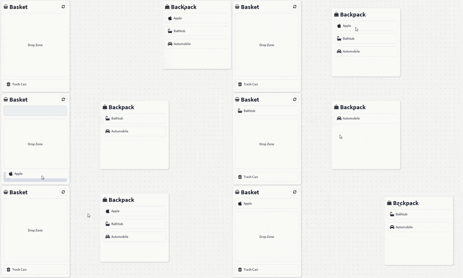
The <Draggable> and <Droppable> components provide a simple way to move GUI elements and detect valid drop targets.
You can wrap a component such as a <Container> in the <Draggable> tag to make it draggable. It must also have a <Draggable.Handle> within the draggable component which is used to drag the element around.
A component can be wrapped with <Droppable> to assign it as a drop zone to receive draggable elements.
Set the retainPosition prop on the <Draggable> if you want to use it without a drop zone.
Migrating from 1.3
Two behaviours changed after 1.3:
onDropfires once, on release. It used to fire on every pointer move while hovering, and on every overlapping target. It now fires exactly once when the drag is released, and only on the topmost target under the pointer. Hover feedback that relied on the old repeated calls should move toonDragEnter/onDragLeave.- The topmost target wins. When several drop targets overlap, the one drawn on top now receives the drop (see Drop targets). Previously the target with the lowest
ZIndexwon.
Import
import { Draggable, Droppable } from "@rbxts/react-clean-ui";Basic usage
Drag handles
<Draggable.Handle> marks the part of the draggable element that starts a drag. It takes a single child, which can be a library component or a native Roblox element such as <frame> or <imagebutton>:
<Draggable>
    <frame Size={UDim2.fromOffset(200, 120)}>
        <Draggable.Handle>
            <frame
                Size={new UDim2(1, 0, 0, 24)}
                Event={{
                    InputBegan: () => print("Title bar pressed"),
                }}
            />
        </Draggable.Handle>
    </frame>
</Draggable>
The handle sets Active = true on its child and adds its own InputBegan listener. An InputBegan handler the child already has is kept and still runs first.
Pressing on a GuiButton or TextBox inside the handle does not start a drag, so buttons and text inputs keep working normally.
Input types
By default a drag starts from the left mouse button or a touch. Use inputTypes to choose which inputs can start a drag. The drag ends when the same input is released; releasing any other input is ignored.
This makes it possible to give different buttons different meanings, for example dragging a whole stack with the left button and splitting it with the right button:
<Draggable
    id="stack-12"
    inputTypes={[Enum.UserInputType.MouseButton1, Enum.UserInputType.MouseButton2]}
    onDropped={(droppable, info) => {
        if (droppable === undefined) return;

        if (info.inputType === Enum.UserInputType.MouseButton2) {
            splitStack(info.id, droppable.id);
        } else {
            moveStack(info.id, droppable.id);
        }
    }}
>
    <Container width="64" height="64">
        <Draggable.Handle>
            <Box>
                <Text text="x12" />
            </Box>
        </Draggable.Handle>
    </Container>
</Draggable>
Custom drag preview
By default the element that follows the pointer is a copy of the draggable's child. Pass renderOverlay to draw something else instead. The returned content is placed inside a transparent frame with the same size and position as the dragged element, so size it with scale:
<Draggable
    renderOverlay={() => (
        <Icon icon="cube" Size={UDim2.fromScale(0.5, 0.5)} />
    )}
>
    <Container width="200" height="60">
        <Draggable.Handle>
            <Box>
                <Text text="Inventory item" />
            </Box>
        </Draggable.Handle>
    </Container>
</Draggable>
Drag events
Every Draggable callback receives a DragEventInfo describing the event:
interface DragEventInfo {
    inputType: Enum.UserInputType;
    input: InputObject;
    position: Vector2;
    id?: string;
}| Field | Description |
|---|---|
inputType | The input type that started the drag. |
input | The InputObject of the event that triggered the callback. |
position | The pointer position, in screen coordinates, for that event. |
id | The id of the Draggable being dragged, if one was set. |
onStartDrag(info)fires once when a drag begins.onDragged(droppable, info)fires on every move with the topmostDroppableunder the pointer, orundefinedif there is none.onDropped(droppable, info)fires once on release with the topmostDroppableunder the pointer at that moment, orundefinedif the item was released outside any drop target.
Droppable.onDrop, onDragEnter and onDragLeave receive the dragged GuiObject and the same DragEventInfo, so a drop target can accept or reject a drop based on info.id or info.inputType.
Hover feedback
Use onDragEnter and onDragLeave on a <Droppable> to highlight it while something is dragged over it:
function DropZone() {
    const [hovered, setHovered] = React.useState(false);

    return (
        <Droppable
            id="trash"
            onDragEnter={() => setHovered(true)}
            onDragLeave={() => setHovered(false)}
            onDrop={(object, info) => print(`${info?.id} was dropped in the trash`)}
        >
            <Box
                Size={UDim2.fromOffset(180, 80)}
                border-thickness={hovered ? 3 : 1}
                border-color={hovered ? Color3.fromRGB(220, 60, 60) : undefined}
            >
                <Text text="Trash" />
            </Box>
        </Droppable>
    );
}
onDragEnter fires when the target becomes the topmost target under the pointer. onDragLeave fires when it stops being that target: the pointer moves off it or onto a target drawn above it, the drag is released (after onDrop, if it received the drop), or the dragged Draggable unmounts. Every enter is followed by exactly one leave.
Drop targets
When drop targets overlap, only the one drawn on top at the pointer is hovered or receives the drop. This follows Roblox's own draw order:
- A
ScreenGuiwith a higherDisplayOrderis above one with a lowerDisplayOrder. - Inside one
ScreenGuiusingZIndexBehavior.Sibling, theZIndexof the branches where the two targets split is compared first, then sibling order (later siblings are on top, and descendants are above their ancestors). - Inside one
ScreenGuiusingZIndexBehavior.Global, the targets' ownZIndexis compared first, then their order in the tree.
Drop targets are found wherever they are mounted: in sibling trees, in separate ScreenGuis, or in separate React roots. No wrapper frame or provider is needed to connect a Draggable to a Droppable.
A target is ignored if it, or any of its ancestors, is not Visible, if the pointer is on a part of it clipped away by an ancestor with ClipsDescendants (or a CanvasGroup), or if its ScreenGui is disabled.
Drop information
The two components expose drop information in different forms:
Droppable.onDropreceives the draggedGuiObjectand theDragEventInfo.Draggable.onDraggedandDraggable.onDroppedreceive the matchingDroppableRegistrationand theDragEventInfo.
This allows the draggable to inspect the target id, while the droppable can work directly with the dragged Roblox instance.
<Droppable id="delete-zone" onDrop={(object) => object.Destroy()}>
    <Box Size={UDim2.fromOffset(180, 80)}>
        <Text text="Delete" />
    </Box>
</Droppable>
Props
Draggable props
| Prop | Type | Default | Description |
|---|---|---|---|
id | string | — | Optional identifier stored in the registry and passed as DragEventInfo.id. |
children | ReactElement<GuiObjectProps> | — | The GUI element that will be dragged. |
inputTypes | Enum.UserInputType[] | [Enum.UserInputType.MouseButton1, Enum.UserInputType.Touch] | Inputs that can start a drag from a Draggable.Handle. |
placeholder | boolean | true | Keeps a themed placeholder in the original layout while dragging. |
retainPosition | boolean | false | Moves the original GUI object to the final drag position after release. |
renderOverlay | () => React.ReactNode | — | Custom drag preview. When unset, the preview is a copy of children. |
onStartDrag | (info: DragEventInfo) => void | — | Called once when dragging begins. |
onDragged | (droppable: DroppableRegistration | undefined, info: DragEventInfo) => void | — | Called on every move with the topmost droppable under the pointer. |
onDropped | (droppable: DroppableRegistration | undefined, info: DragEventInfo) => void | — | Called once when the drag ends, with the topmost droppable at the release point. |
Draggable.Handle props
| Prop | Type | Description |
|---|---|---|
children | ReactElement<GuiObjectProps> | A single native element or component that starts the drag when pressed. |
Droppable props
| Prop | Type | Description |
|---|---|---|
id | string | Optional identifier returned in the droppable registration. |
children | ReactElement<GuiObjectProps> | The GUI element that defines the drop area. |
onDrop | (draggedObject: GuiObject, info?: DragEventInfo) => void | Called once when a draggable is released over this target while it is topmost. |
onDragEnter | (draggedObject: GuiObject, info: DragEventInfo) => void | Called when a drag moves onto this target and it becomes the topmost target. |
onDragLeave | (draggedObject: GuiObject, info: DragEventInfo) => void | Called when this target stops being the hovered topmost target. |
info on onDrop is always present when a Draggable triggers the drop. It is only missing if your own code calls registration.drop(object) directly.
Behaviour
- Only one draggable can be active at a time, across every mounted
Draggable, including those in other React roots. Starting a drag while another is in progress is ignored. - The drag ends only when the input that started it is released. Releasing a different mouse button or key does nothing.
- On release, the topmost droppable gets
onDropfirst, then the last hovered droppable getsonDragLeave, then the draggable'sonDroppedfires. - Releasing outside any drop target calls no
Droppablecallback, andonDroppedreceivesundefined. - A
Droppabledoes not filter by whichDraggableis being dragged. Accept or reject a drop inonDropusinginfo.idor the draggedGuiObject. - While dragging, the original element stays mounted but hidden, and the placeholder (if enabled) keeps its place in the layout.
- The drag preview is inert:
Draggable.Handles inside it start nothing,Droppables and nestedDraggables inside it don't register, andTooltips inside it never open. An item can't be dropped onto its own preview. - Tooltips inside the dragged element close for the duration of the drag, and only reopen on the next hover.
- The drag preview is positioned using absolute screen coordinates and rendered through the nearest overlay provider. Without an overlay provider there is no preview, but the drag still works. When
retainPositionis enabled, the final absolute position is converted back into an offset relative to the original parent. - Neither component needs a registry provider. If one is present, registrations are also added to it.
Theme values
The placeholder shown while dragging is styled by theme.components.draggable.placeholder:
backgroundColorandbackgroundTransparencyset the placeholder's fill.borderColorandborderThicknessset an inner stroke around the placeholder.cornerRadiusrounds the placeholder's corners.
Droppable has no theme values. Style hover states yourself with onDragEnter and onDragLeave.