Tooltip
Display helpful information when users hover over an element.
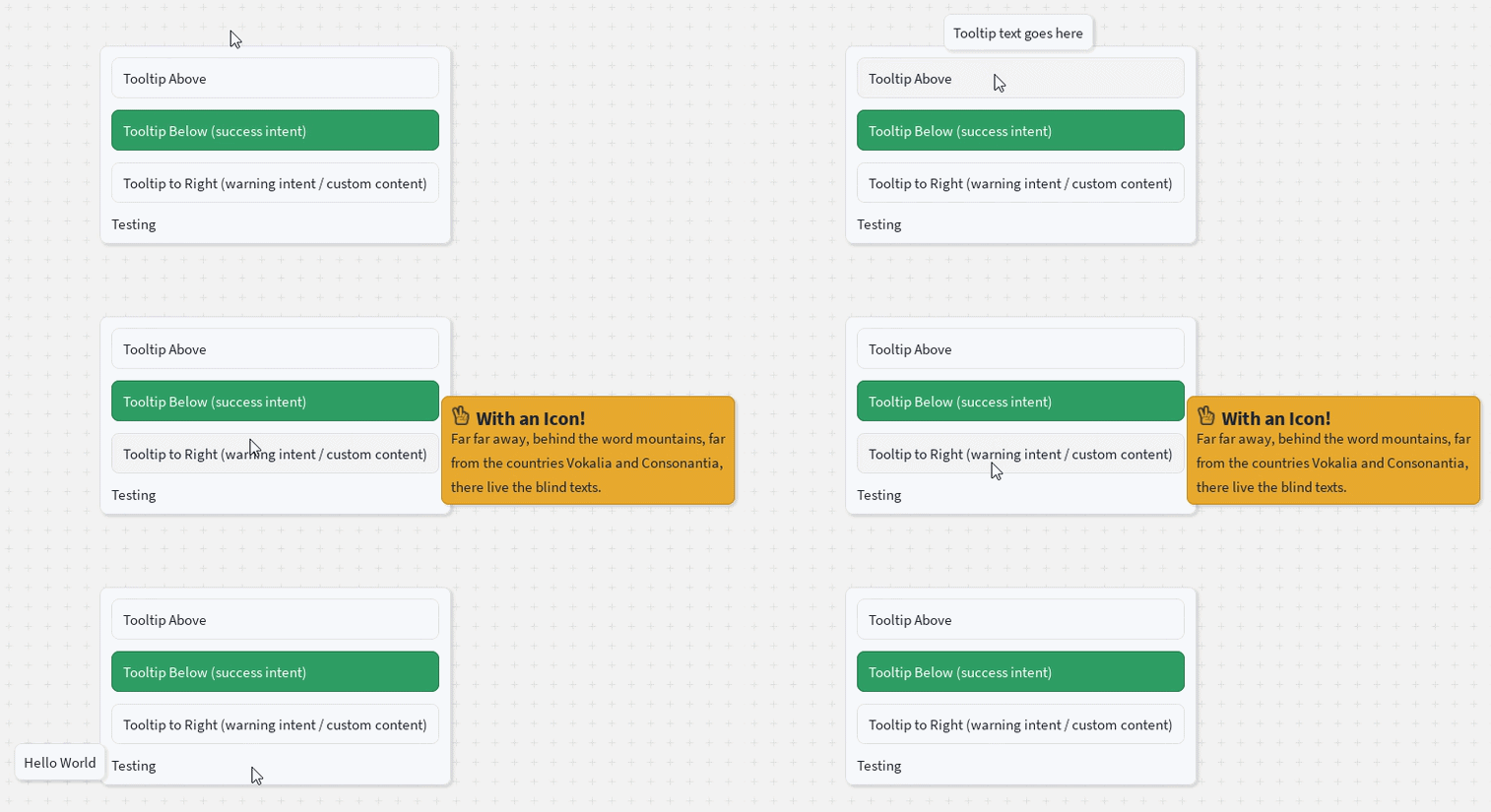
Tooltips provide additional context for buttons, text, and other interface elements without taking up permanent space. They appear when the user hovers over the wrapped element. The tooltip can display either simple text or custom React content.
Basic Usage
Wrap any single UI element with a Tooltip and provide the tooltip content.
The wrapped element can be a library component or a native Roblox element such as <frame> or <imagebutton>. Any MouseEnter / MouseLeave handlers the child already has are kept and run first.
<Tooltip content="Health potion">
    <imagebutton
        Size={UDim2.fromOffset(48, 48)}
        Image="rbxassetid://0000000"
        Event={{
            MouseEnter: () => print("Hovered slot"),
        }}
    />
</Tooltip>
Placement
Use the placement prop to control where the tooltip appears relative to its target.
<Tooltip content="Above" placement="Top">
    <Button text="Top" />
</Tooltip>

<Tooltip content="Below" placement="Bottom">
    <Button text="Bottom" />
</Tooltip>

<Tooltip content="Left" placement="Left">
    <Button text="Left" />
</Tooltip>

<Tooltip content="Right" placement="Right">
    <Button text="Right" />
</Tooltip>

<Tooltip content="Centered" placement="Center">
    <Button text="Center" />
</Tooltip>
"Center" positions the tooltip directly over the middle of its target instead of pointing at an edge, and hides the pointer arrow.
Intent
Tooltips support the standard intent colors.
<Tooltip
    content="Operation completed successfully!"
    intent="success"
>
    <Button intent="success" text="Success" />
</Tooltip>
Custom Content
The content prop can contain any React element, allowing you to build richer tooltips.
<Tooltip
    placement="Right"
    intent="warning"
    content={
        <Container>
            <VStack spacing="None">
                <HStack>
                    <Icon icon="hand-peace-o" />
                    <Text text="With an Icon!" variant="heading" />
                </HStack>

                <Text text="You can place any React UI inside a tooltip." />
            </VStack>
        </Container>
    }
>
    <Button text="Custom Tooltip" />
</Tooltip>
Disabling
Set disabled to stop the tooltip from showing. If it is already open, it fades out.
<Tooltip content="Drag to move" disabled={isDragging}>
    <Button text="Item" />
</Tooltip>
Toggling disabled does not change the wrapped element: it is not remounted and keeps its ref and event handlers. This makes it safe to toggle while the element sits under a Draggable.Handle, even in the middle of a drag.
Controlled visibility
Pass open to control visibility yourself. While open is set, hovering no longer shows or hides the tooltip. Leave it undefined for the normal hover behaviour.
<Tooltip content="Click here to continue" open={tutorialStep === 3}>
    <Button text="Continue" />
</Tooltip>
disabled always wins: a tooltip with disabled set stays hidden even when open is true.
Props
| Prop | Type | Default | Description |
|---|---|---|---|
content | string | React.ReactNode | Required | The content displayed inside the tooltip. |
placement | "Top" | "Bottom" | "Left" | "Right" | "Center" | "Top" | Controls where the tooltip appears. |
intent | Intent | "primary" | Applies one of the standard intent color schemes. |
spacing | Spacing | Theme default | Controls the internal padding of the tooltip. |
disabled | boolean | false | Prevents the tooltip from showing and hides it if open. Overrides open. |
open | boolean | — | Controls visibility directly. When set, hover is ignored. |
children | React.ReactElement | Required | The element that triggers the tooltip when hovered. Can be a component or a native element. |
Behaviour
- The tooltip is rendered through the nearest overlay provider, so it appears above surrounding content and is not clipped by the target's ancestors. Without an overlay provider it never renders.
- While visible, the tooltip follows its target if the target moves or resizes.
- Tooltips inside a
Draggable's drag preview never open, and tooltips inside the element being dragged close for the duration of the drag. - After being suppressed (by
disabledor a drag), a hover-driven tooltip does not pop back open on its own. It reopens on the next hover.