Menu
A collapsible vertical navigation menu with icon-based menu items.
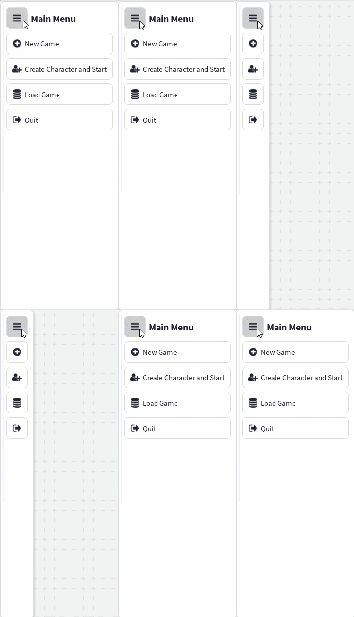
The Menu component displays a vertical navigation menu that can be expanded or collapsed.
When expanded, the menu displays its title and the title of each menu item. When collapsed, only the menu item icons remain visible.
Import
import { Menu } from "@rbxts/react-clean-ui";Basic Usage
Use Menu.Item to add navigation actions to the menu.
The button in the menu header toggles the collapsed state.
Layout
A menu will normally be placed inside a container with a defined height.
The menu automatically sizes itself horizontally based on its title and menu items. Its item list is placed inside a Scroller, allowing longer menus to scroll vertically.
<Container>
    <Box
        width="Auto"
        height="100%"
    >
        <Menu title="Main Menu">
            <Menu.Item
                title="New Game"
                icon="plus-circle"
            />

            <Menu.Item
                title="Create Character"
                icon="user-plus"
            />

            <Menu.Item
                title="Load Game"
                icon="database"
            />

            <Menu.Item
                title="Quit"
                icon="sign-out"
            />
        </Menu>
    </Box>
</Container>
Handling Item Events
Menu.Item supports the same Event prop as Button.
Use the Activated event to respond when a menu item is selected.
<Menu title="Game Menu">
    <Menu.Item
        title="New Game"
        icon="plus-circle"
        Event={{
            Activated: () => {
                print("Starting a new game");
            },
        }}
    />

    <Menu.Item
        title="Quit"
        icon="sign-out"
        Event={{
            Activated: () => {
                print("Quitting");
            },
        }}
    />
</Menu>
Initially Collapsed
Set collapsed to true to make the menu initially render in its collapsed state.
<Menu
    title="Main Menu"
    collapsed
>
    <Menu.Item
        title="New Game"
        icon="plus-circle"
    />

    <Menu.Item
        title="Create Character"
        icon="user-plus"
    />

    <Menu.Item
        title="Load Game"
        icon="database"
    />

    <Menu.Item
        title="Quit"
        icon="sign-out"
    />
</Menu>
The collapsed prop controls only the initial state. After the component mounts, the menu manages its collapsed state internally.
Multiple Menus
Menus can be positioned independently within the same interface.
<Container>
    <Box
        width="Auto"
        height="100%"
    >
        <Menu title="Main Menu">
            <Menu.Item
                title="New Game"
                icon="plus-circle"
                Event={{
                    Activated: () => {
                        print("Clicked New Game");
                    },
                }}
            />

            <Menu.Item
                title="Create Character and Start"
                icon="user-plus"
            />

            <Menu.Item
                title="Load Game"
                icon="database"
            />

            <Menu.Item
                title="Quit"
                icon="sign-out"
            />
        </Menu>
    </Box>
</Container>

<Container right="0px">
    <Box
        width="Auto"
        height="100%"
    >
        <Menu title="Really Long Menu Name">
            <Menu.Item
                title="New Game"
                icon="plus-circle"
                Event={{
                    Activated: () => {
                        print("Clicked New Game");
                    },
                }}
            />

            <Menu.Item
                title="Create Character"
                icon="user-plus"
            />

            <Menu.Item
                title="Load Game"
                icon="database"
            />

            <Menu.Item
                title="Quit"
                icon="sign-out"
            />
        </Menu>
    </Box>
</Container>
Each menu manages its collapsed state independently.
Menu Props
| Prop | Type | Default | Description |
|---|---|---|---|
title | string | Required | The title displayed in the menu header while the menu is expanded. |
collapsed | boolean | false | Determines whether the menu is initially collapsed. |
children | React.ReactNode | undefined | The menu content, normally a collection of Menu.Item components. |
Menu.Item Props
Menu.Item's prop type extends ButtonProps, but only the props below are currently forwarded to the underlying Button.
| Prop | Type | Default | Description |
|---|---|---|---|
title | string | Required | The text displayed by the item while the menu is expanded. |
icon | IconName | undefined | The icon displayed by the menu item. The icon remains visible while the menu is collapsed. |
Event | React.InstanceEvent<ImageButton> | undefined | Roblox events attached to the underlying button. |
The underlying button is always rendered with group enabled, so a Menu.Item always participates in the menu's shared sizing group — this is not configurable per item.
Other ButtonProps fields (such as intent, spacing, group, or disabled) type-check because Menu.Item's prop type extends ButtonProps, but they are not currently forwarded to the underlying Button and have no effect.
Collapsed Behaviour
The menu uses NavigationContext to share its collapsed state with each Menu.Item.
While expanded:
- The menu title is visible.
- Item titles are visible.
- Item icons are visible.
While collapsed:
- The menu title is hidden.
- Item titles are hidden.
- Item icons remain visible.
Because item titles are hidden rather than replaced, each menu item should normally include an icon so that it remains identifiable in the collapsed state.
Group Sizing
The menu is wrapped in a Group, and its controls participate in shared sizing.
This allows the header and menu item buttons to expand to the width required by the longest visible title. When the menu is collapsed, the width reduces to fit the icon-only controls.
<Menu title="Character Management">
    <Menu.Item
        title="Create Character"
        icon="user-plus"
    />

    <Menu.Item
        title="Delete"
        icon="trash"
    />
</Menu>
In this example, the shorter Delete item receives the same width as the wider Create Character item while the menu is expanded.
Scrolling
The menu's item list is rendered inside a vertical Scroller.
When the menu items require more vertical space than is available, the list becomes scrollable while the menu header remains visible.
<Box
    width="Auto"
    height="300px"
>
    <Menu title="Inventory">
        <Menu.Item title="Weapons" icon="sword" />
        <Menu.Item title="Armour" icon="shield" />
        <Menu.Item title="Consumables" icon="flask" />
        <Menu.Item title="Materials" icon="cubes" />
        <Menu.Item title="Quest Items" icon="scroll" />
        <Menu.Item title="Key Items" icon="key" />
        <Menu.Item title="Settings" icon="cog" />
    </Menu>
</Box>
For scrolling to work correctly, the menu should be placed inside a parent with a constrained height.