Chart
Pie Chart
Display data as proportional segments of a circle.
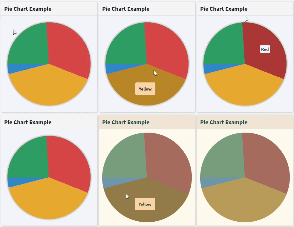
The Pie component displays values as slices of a circle, making it easy to visualize proportions and percentages. Each segment is sized relative to the total of all values.
Basic Example
<Pie
    values={[
        { value: 30, label: "Green" },
        { value: 40, label: "Red" },
        { value: 50, label: "Yellow" },
    ]}
/>
Labels
Each segment can display a label. A label may simply be a string:
{ value: 30, label: "Green" }Or a custom label object:
{
    value: 50,
    label: {
        text: "Yellow",
        BackgroundColor3: Color3.fromHex("#FAD5A5"),
    },
}
You can also provide completely custom React content:
{
    value: 5,
    label: {
        content: (
            <Button
                icon="check-square"
                text="Blue"
                intent="info"
            />
        ),
    },
}
Custom Colors
By default, segment colors are taken from the current theme. Individual slices can override this by supplying a color.
values={[
    {
        value: 25,
        color: Color3.fromHex("#FF6B6B"),
    },
    {
        value: 75,
        color: Color3.fromHex("#4D96FF"),
    },
]}
Hover & Click
The pie chart supports hover and click callbacks.
<Pie
    values={values}
    onChangeSelected={(index, value) => {
        print(index, value);
    }}
    onClick={(index, value) => {
        print(`Clicked ${index}`);
    }}
/>
Properties
| Property | Description |
|---|---|
values | Array of pie segments. |
label-distance | Distance of labels from the center (0–1). |
label-spacing | Padding used for text labels. |
label-hover | Only show labels while hovering a segment. |
Label-hidden | Hide all labels. |
hover-darken | Darkens (or lightens if negative) the hovered segment. |
onChangeSelected | Fired when the hovered segment changes. |
onClick | Fired when a segment is clicked. |
Demo
The following story demonstrates string labels, custom label styling, custom React content, hover effects, and click callbacks.